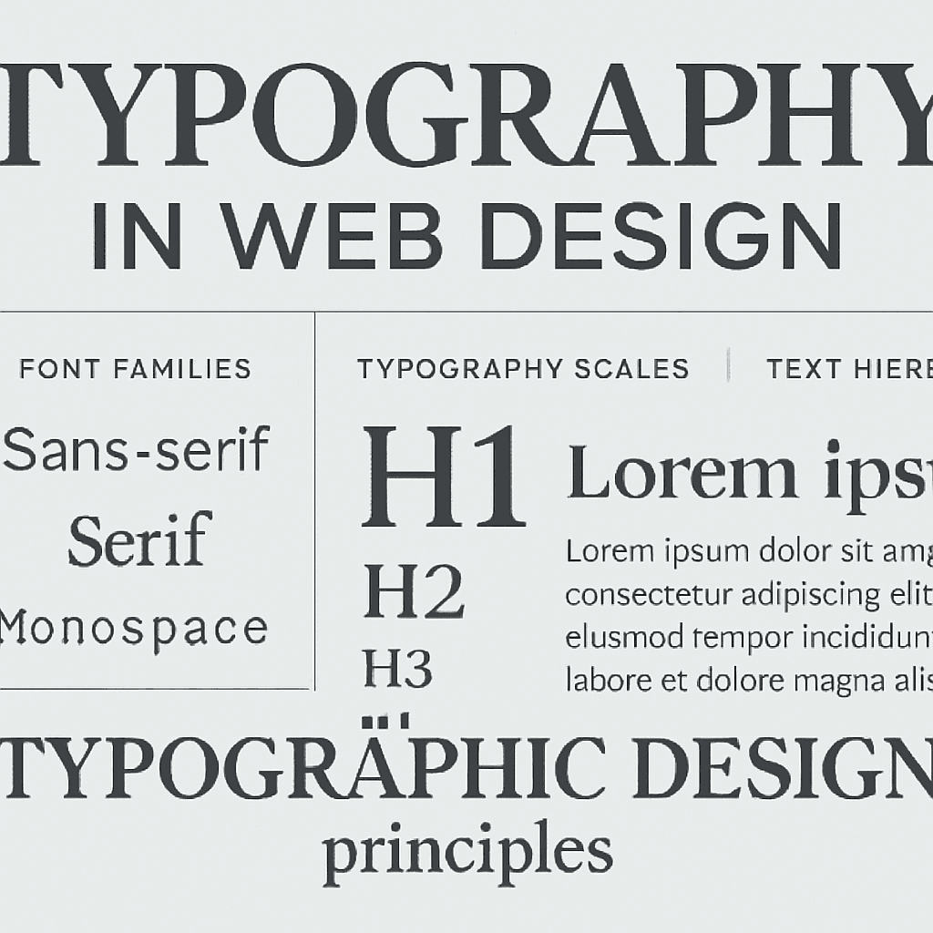
Typography is far more than just picking a nice-looking font. It's about choosing typefaces that are readable, align with your brand, and enhance the overall user experience. Poor typography can make even the best content difficult to read and diminish your brand credibility.
Types of Fonts:
1. Serif Fonts: Traditional, formal appearance. Good for body text in publications but less common on web. 2. Sans-Serif Fonts: Clean, modern, highly readable. Ideal for web design. 3. Script Fonts: Decorative, elegant. Use sparingly for headings or branding. 4. Monospace Fonts: Fixed width, suitable for code snippets and technical content.
Web-Safe Font Combinations:
- Headlines: Larger sans-serif fonts (Helvetica, Arial, Verdana)
- Body text: Clean, readable sans-serif or serif fonts (Georgia, Times New Roman)
- Code: Monospace fonts (Courier New, Consolas)
Typography Best Practices:
1. Limit Font Count: Use 2-3 fonts maximum. Too many fonts create visual chaos.
2. Maintain Hierarchy: Use different sizes and weights to establish clear hierarchy.
3. Ensure Readability: - Body text should be 16px minimum - Line height should be 1.5-1.6 for comfortable reading - Line length should be 50-75 characters
4. Use White Space: Adequate spacing around text improves readability and reduces cognitive load.
5. Test Responsiveness: Ensure fonts resize properly on mobile devices.
6. Consider Loading Times: Web fonts should be optimized; too many or poorly optimized fonts slow page loading.
7. Maintain Consistency: Use consistent typography across all pages and sections.
Popular Web Fonts:
- Google Fonts: Free, diverse selection
- Adobe Fonts: Professional quality
- Typekit: Premium fonts
- Font Awesome: Icon fonts
Typography is often overlooked but is crucial to creating professional, readable websites that users enjoy. The right typography choices enhance readability, reinforce brand identity, and improve overall user satisfaction.

مقالات ذات صلة

تصميم الموقع الإمارات: خلق التميز الرقمي لعملك
اكتشف كيفية أن تصميم الموقع الاحترافي في الإمارات يمكن أن يحول وجودك عبر الإنترنت ويحقق نتائج ذات مغزى.
اقرأ المقال
تصميم الويب المتجاوب: ضروري لنجاح الأعمال الحديثة
تعرّف على أهمية التصميم المتجاوب وتأثيره على ترتيبك في محركات البحث وتجربة المستخدم.
اقرأ المقال
اتجاهات تصميم الويب الحديثة 2024: إنشاء مواقع ويب مذهلة
اكتشف أحدث اتجاهات تصميم الويب التي تجعل المواقع جميلة وسهلة الاستخدام وموجهة للتحويل.
اقرأ المقال