In this article+
- 011. A clearer visual hierarchy, not a busier homepage
- 022. Purposeful whitespace and focused content blocks
- 033. Typography that reflects the brand and supports reading
- 044. Authentic photography and restrained visual storytelling
- 055. Subtle motion with a practical purpose
- 066. Accessible contrast, navigation, and interaction states
- 077. Modular design systems that keep pages consistent
- 088. Contextual personalization rather than intrusive tricks
- 099. AI-assisted workflows without publishing unverified claims
- 1010. Choose trends by business value, not novelty
- 11A practical example: refreshing a service page
- 12Frequently Asked Questions
- 13Is minimalist web design always better?
- 14Should every business website use animation?
- 15Are modern design trends compatible with Arabic websites?
- 16Does a modern-looking website automatically rank higher on Google?
- 17When is a redesign preferable to smaller improvements?
- 18How can a company tell whether a design trend is working?
- 19Final thoughts: design for understanding and action
# Modern Web Design Trends: Which Ones Actually Help Businesses?
A new website can look current on launch day and still frustrate customers. Oversized animations, fashionable fonts, and unusual navigation may impress in a design presentation, but they do not necessarily help someone understand a service or request a quote.
For businesses in the UAE, the useful question is not which visual trend is most popular. It is which design decisions make information clearer, strengthen a credible brand, and support the customer journey in both Arabic and English when those languages are offered.
This guide evaluates practical approaches to modern website design, explains when they work, and shows how to assess them before committing development time and budget. It is a decision guide, not a catalogue of visual effects.
1. A clearer visual hierarchy, not a busier homepage
A strong page makes its priorities obvious. Visitors should be able to identify the business, the relevant service, and the next useful action without decoding a crowded layout.
Visual hierarchy comes from differences in heading size, spacing, placement, contrast, and content grouping. The most prominent element should represent the page's purpose—not an unrelated promotional message.
For example, a consultancy homepage can lead with a concise statement of whom it serves, followed by the main practice areas and a direct enquiry route. A product catalogue may instead prioritize category discovery and filters.
When it helps: When customers frequently ask what the company does or cannot find the right service.
Watch out for: Removing essential explanations in the pursuit of a minimal appearance.
2. Purposeful whitespace and focused content blocks
Whitespace is the breathing room between content elements. Used well, it separates ideas and makes scanning easier. It is not a reason to leave customers without information.
A page with one clearly defined idea per section can feel easier to understand than a page with multiple claims, badges, and buttons competing for attention. Short headings, informative descriptions, and relevant supporting visuals work together.
The appropriate spacing depends on the page. A campaign landing page may benefit from spacious sections, while a comparison table needs efficient use of screen space.
When it helps: For complex services that need to be explained in an approachable sequence.
Watch out for: Excessive empty space on mobile that forces people to scroll through decoration before reaching useful details.
3. Typography that reflects the brand and supports reading
Typography is both a brand decision and a usability decision. A distinctive display typeface may suit short headings, but long paragraphs, interface labels, and form instructions need reliable legibility.
For bilingual UAE websites, test Arabic and Latin type together. Matching them by nominal font size alone may produce uneven visual weight, line height, or spacing. Arabic characters and mixed-language contact details should remain readable at normal screen sizes.
Test typography in real content: long service names, multi-line headings, pricing qualifiers if applicable, and error messages. Check contrast and wrapping on smaller screens.
When it helps: When the current design feels inconsistent across pages or languages.
Watch out for: Thin type, insufficient contrast, and decorative fonts used in navigation or body copy.
4. Authentic photography and restrained visual storytelling
A photograph can explain an environment, product, team, or result more effectively than a generic decorative image. Businesses should prefer visuals that accurately represent their work and that they have permission to use.
For a technical service, a real image of equipment or an actual work process may answer a customer question. For a professional service, an organized team or genuine workplace image can provide context. Photography should support the nearby text, not replace it.
Keep image dimensions appropriate to the layout and provide useful alternative text where the image conveys information.
When it helps: When the business has real work, spaces, people, or products that customers want to evaluate.
Watch out for: Stock-like imagery that misrepresents the company, oversized files, and text embedded inside images that cannot adapt to languages or screen sizes.
5. Subtle motion with a practical purpose
Animation is most useful when it explains an interaction: showing that a menu opened, a form was submitted, or content changed. Motion may also guide attention, but it should not interrupt reading.
Avoid delaying access to important content with elaborate page entrances or autoplay effects. Honor reduced-motion preferences, and verify that buttons remain available while transitions run.
A small state change on a selected tab often communicates more than a large animated hero that repeats on every visit.
When it helps: When visitors need feedback after an interaction.
Watch out for: Motion that causes distraction, poor responsiveness, or difficulty for users sensitive to movement.
6. Accessible contrast, navigation, and interaction states
Accessibility is not a temporary aesthetic trend; it is part of responsible design. The design must remain understandable when visitors navigate with a keyboard, enlarge text, or use assistive technology.
Links should look interactive, controls need discernible labels, and focus indicators should remain visible. Color should not be the only way to communicate errors or status. Navigation menus must work without requiring a precise pointer movement.
The same checks apply to Arabic interfaces, where reading direction and component alignment can introduce additional issues.
When it helps: On every business website, especially sites with forms, menus, filtering, or interactive tools.
Watch out for: Stylish low-contrast palettes and hidden focus states.
7. Modular design systems that keep pages consistent
A design system defines reusable decisions: typography scales, spacing, colors, components, and interaction patterns. For a growing website, consistency reduces the risk of every new service page looking like a different product.
This does not mean all pages must use the same layout. A service detail page, article, and project case study can have different structures while sharing recognizable buttons, headings, and navigational rules.
For bilingual sites, shared components should support right-to-left and left-to-right presentation without separate improvised versions of every element.
When it helps: When a business regularly adds services, locations, content, or languages.
Watch out for: Rigid templates that force unrelated page types to look identical.
8. Contextual personalization rather than intrusive tricks
Some websites can tailor content according to a visitor's explicit choices, such as selecting an industry, service type, or language. Useful personalization helps people reach relevant information faster.
It should be understandable and easy to reverse. For example, a services directory that lets users filter by business need offers practical control. A page that constantly changes headings based on uncertain assumptions may instead undermine trust.
Respect privacy requirements, avoid collecting information that is not needed, and do not let personalized presentation create inconsistent crawlable content.
When it helps: Where a business has distinct audiences or service pathways.
Watch out for: Hidden logic, misleading urgency messages, or personalization that makes the basic website harder to navigate.
9. AI-assisted workflows without publishing unverified claims
AI-assisted tools may speed up early wireframes, content organization, accessibility checks, or design exploration. Their outputs still require human review for factual accuracy, brand suitability, copyright, and customer relevance.
A visually polished draft does not prove that the text is correct or that the interface works with real users. An automated accessibility check also does not replace manual keyboard and screen-reader testing.
Businesses should treat these tools as support for a defined review process, not as permission to publish generic layouts or invented testimonials.
When it helps: During structured exploration and repetitive quality checks.
Watch out for: Unreviewed content, inconsistent branding, and fictional case studies.
10. Choose trends by business value, not novelty
Before adopting a design treatment, ask:
1. What customer problem does it solve? 2. Can we test the improvement on mobile and desktop? 3. Will it work in Arabic and English where both are provided? 4. Does it affect loading, interaction, or accessibility? 5. Can the company maintain it as content changes? 6. What observable result will show whether it helped?
A redesign decision may be measured by task completion, successful enquiries, fewer navigation problems, or clearer service comprehension. A click on a contact button is useful interaction data, but it is not the same as a qualified lead or sale.
A practical example: refreshing a service page
Suppose visitors frequently land on a technical service page but leave before discovering what is included. Replacing the page with a fashionable full-screen animation may not address the problem.
A more useful design change might include a specific heading, a visible service scope, relevant work photographs, a short process explanation, and a contextual enquiry action. The visual treatment can be modern and restrained while the information becomes easier to use.
This is the difference between decorating a page and improving the customer's experience.
Frequently Asked Questions
Is minimalist web design always better?
No. Simpler presentation can improve clarity, but removing useful details may make it harder for customers to evaluate a service. The right level of detail depends on the task and audience.
Should every business website use animation?
No. Motion should communicate useful feedback or guide attention without blocking content, slowing interaction, or ignoring reduced-motion preferences.
Are modern design trends compatible with Arabic websites?
Yes, when components, typography, spacing, and interactions are tested specifically for right-to-left reading. Mirroring a layout without language review is not sufficient.
Does a modern-looking website automatically rank higher on Google?
No. Visual style alone does not determine rankings. Useful content, technical accessibility, appropriate search intent, and page experience all need attention.
When is a redesign preferable to smaller improvements?
A larger redesign may be justified when the site's structure, branding, or core interactions no longer support business needs. If the problem is limited to a few pages or components, focused improvements may be more efficient.
How can a company tell whether a design trend is working?
Define a measurable user task first, establish a baseline, and compare relevant behavior after the change. Review the quality of enquiries as well as clicks or visual engagement.
Final thoughts: design for understanding and action
Modern web design is most valuable when it makes a business easier to understand and interact with. Clear hierarchy, readable typography, authentic visuals, accessible controls, and purposeful motion can work together without turning the site into a collection of fashionable effects.
If your business is reviewing its website design, Smart Screen DXB can discuss the current customer journey, brand presentation, language requirements, and areas where a targeted improvement may be more useful than a complete redesign.
Discuss a website design review on WhatsApp: https://wa.me/971505926822

Planning a Website in Dubai?
Discuss your website scope with our team and request a tailored quotation.
Discuss on WhatsAppWebsite design in DubaiSelected reading
Related Articles
Website Design UAE: Creating Digital Excellence for Your Business
Discover how professional website design in UAE can transform your business online presence and drive meaningful results.
Read article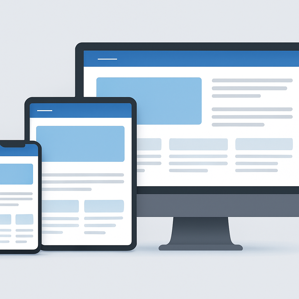
Responsive Website Design: A Practical Business Guide
Learn how responsive website design improves mobile usability, navigation, images, tables and bilingual layouts, with practical testing advice for businesses.
Read article
Website Performance Optimization: A Practical Guide
Learn how to optimize website performance using Core Web Vitals, improve image loading, reduce JavaScript delays and verify real user experience.
Read article