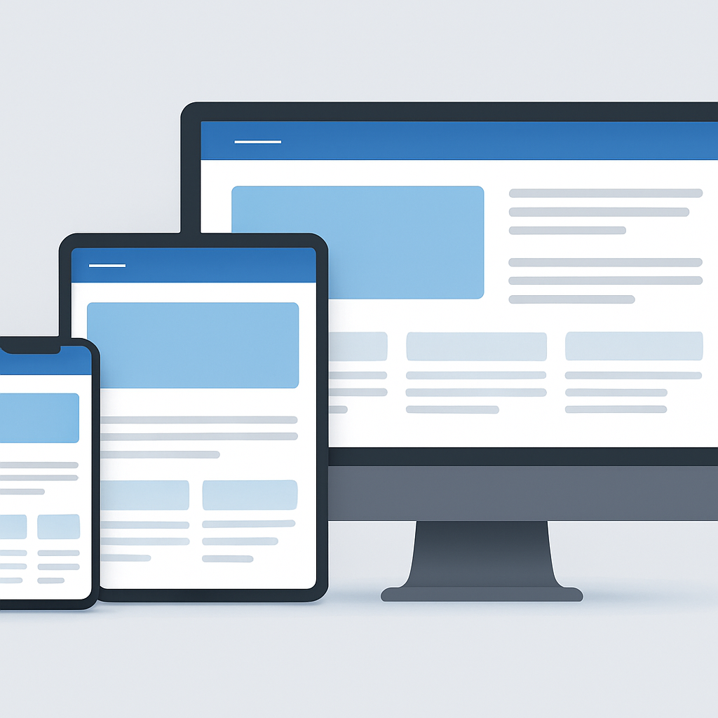
Responsive website design has become non-negotiable in today's mobile-first world. With over 75% of web traffic coming from mobile devices, a website that doesn't adapt to different screen sizes is essentially losing three-quarters of its potential visitors.
Responsive design means your website automatically adjusts its layout, images, and content to fit any device - whether it's a large desktop monitor, tablet, or smartphone. This creates a seamless user experience across all platforms.
Key benefits of responsive design include:
- Better SEO performance (Google favors mobile-friendly sites)
- Increased conversion rates
- Reduced bounce rate
- Lower maintenance costs (one codebase instead of multiple versions)
- Future-proof technology
- Improved accessibility
At Smart Screen Technology, we ensure every website we build is fully responsive and optimized for performance on all devices. This approach not only improves user satisfaction but also directly impacts your bottom line.
Studies show that 53% of users abandon websites that take more than 3 seconds to load. With responsive design implemented correctly, you can ensure fast loading times across all devices.
---
تصميم الويب المتجاوب أصبح ضرورة لا مفر منها في العالم الحالي الموجه نحو الجوال. مع أكثر من 75% من حركة الويب القادمة من الأجهزة المحمولة، موقع الويب الذي لا يتكيف مع أحجام الشاشات المختلفة يفقد بشكل أساسي ثلاثة أرباع زواره المحتملين.
التصميم المتجاوب يعني أن موقعك ينظم نفسه تلقائياً - سواء كان على شاشة سطح مكتب كبيرة أو جهاز لوحي أو هاتف ذكي. هذا ينشئ تجربة مستخدم سلسة على جميع المنصات.
فوائد التصميم المتجاوب تشمل:
- أداء أفضل في محركات البحث (جوجل يفضل المواقع الصديقة للجوال)
- زيادة معدلات التحويل
- تقليل معدل الارتداد
- تكاليف صيانة أقل (قاعدة رموز واحدة بدلاً من عدة إصدارات)
- تكنولوجيا موجهة نحو المستقبل
- إمكانية الوصول المحسّنة
في Smart Screen Technology، نضمن أن كل موقع ننشئه متجاوب تماماً ومحسّن للأداء على جميع الأجهزة. هذا النهج لا يحسّن رضا المستخدم فحسب بل يؤثر بشكل مباشر على أرباحك.
الدراسات تظهر أن 53% من المستخدمين يتخلون عن المواقع التي تستغرق أكثر من 3 ثوانٍ للتحميل. مع تطبيق التصميم المتجاوب بشكل صحيح، يمكنك ضمان أوقات تحميل سريعة على جميع الأجهزة.
FAQ
الأسئلة الشائعة
What is responsive website design?
Responsive design uses flexible layouts, media rules, scalable content, and suitable interaction patterns so a website adapts to different viewport sizes and input methods.
Why is responsive design important for mobile users?
It prevents visitors from needing to zoom, pan, or fight oversized controls, making it easier to read content, complete forms, navigate services, and take the intended next step.
Is responsive design the same as a separate mobile website?
No. A responsive site generally uses one URL and one content system that adapts to the screen, avoiding additional mobile-site maintenance and canonical concerns.
How does responsive design support SEO?
A consistent URL and content experience make pages easier to crawl and understand. Responsive implementation supports mobile usability but does not replace useful content, technical SEO, or performance work.
What should be tested on a responsive website?
Test navigation, text wrapping, images, forms, tables, touch targets, keyboard access, orientation changes, browsers, and key conversion paths across representative screen sizes.
How do responsive images improve performance?
Serving appropriately sized images reduces unnecessary downloads, especially on mobile connections. Dimensions, compression, and meaningful alternative text should be considered together.
Does responsive design guarantee fast loading?
No. Speed also depends on assets, scripts, fonts, hosting, caching, server response, and third-party services. Performance should be measured on realistic devices and connections.
How often should responsive layouts be reviewed?
Review them whenever major content, navigation, analytics, browser, or product changes are introduced, using real device data and important user flows.

تخطط لإنشاء موقع إلكتروني في دبي؟
ناقش نطاق موقعك مع فريقنا واطلب عرض سعر مناسبًا لاحتياجاتك.
ناقش معنا عبر واتسابخدمات تصميم المواقع في دبيSelected reading
مقالات ذات صلة
تصميم الموقع الإمارات: خلق التميز الرقمي لعملك
اكتشف كيفية أن تصميم الموقع الاحترافي في الإمارات يمكن أن يحول وجودك عبر الإنترنت ويحقق نتائج ذات مغزى.
اقرأ المقال
اتجاهات تصميم الويب الحديثة 2024: إنشاء مواقع ويب مذهلة
اكتشف أحدث اتجاهات تصميم الويب التي تجعل المواقع جميلة وسهلة الاستخدام وموجهة للتحويل.
اقرأ المقال
تحسين أداء الموقع: السرعة مهمة للتحويلات
أتقن تقنيات تحسين الموقع لتحسين سرعة الصفحة وتقليل معدل الارتداد وزيادة التحويلات.
اقرأ المقال